
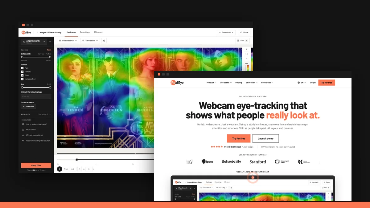
RealEye looks different. We rebuilt two things from the ground up: the dashboard you work in and the website you land on. It is the same product with the same features, in a much clearer shape.
This post walks through both. And because we are an eye-tracking company, we did not redesign the homepage and hope for the best. We ranked it against twelve top SaaS homepages, found out that the new design scored worse than the old one, and fixed it. That story is in the second half, with a short video.
A new look for the dashboard
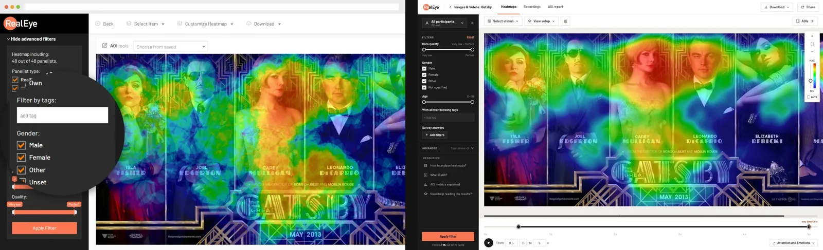
The dashboard has a new design system, built for long sessions with a lot of data on the screen.
- Calmer screens. Flat, rectangular panels, one accent colour and far less visual noise, so the heatmap is the loudest thing you see.
- Everything where it was. Studies, heatmaps, recordings, AOI reports and data quality work the same way and live in the same places. There is nothing to relearn.
- Rebuilt, not repainted. The new interface is a separate front end written from scratch, without the old UI framework underneath.
- Your choice. Turn on the New look switch in the top bar to try it. You can switch back from the sidebar at any time.
A new website
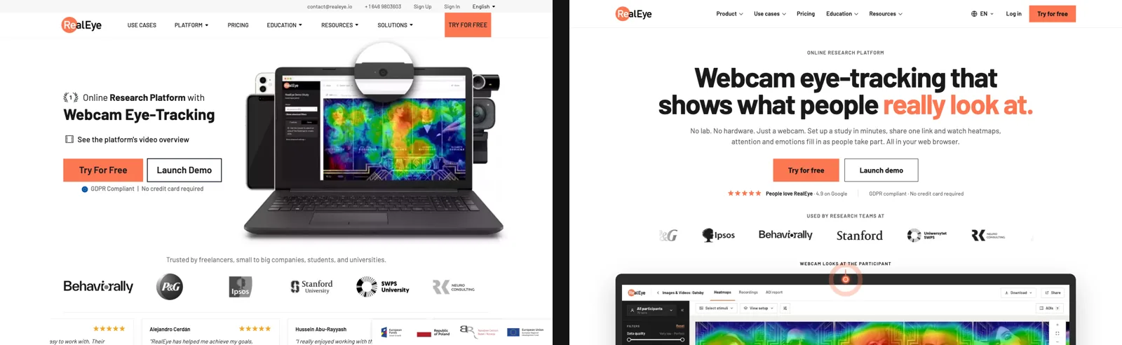
Our previous homepage dated from 2021. The new one is built around a single sentence, Webcam eye-tracking that shows what people really look at, and around the questions people actually ask us: how accurate it is, how it compares with a lab eye tracker, what happens to the camera image (it never leaves the participant's computer), and which devices and participants it works with.
The rest of the site follows the same design: feature pages, use cases, pricing, education, the blog and the support pages.
Then we tested our own homepage
A page that looks better does not automatically work better. So before launch we ran the new homepage through Attention Predictor, our AI model trained on real eye-tracking data. It predicts where people will look in the first seconds, as a heatmap and as a score for every area of the page.
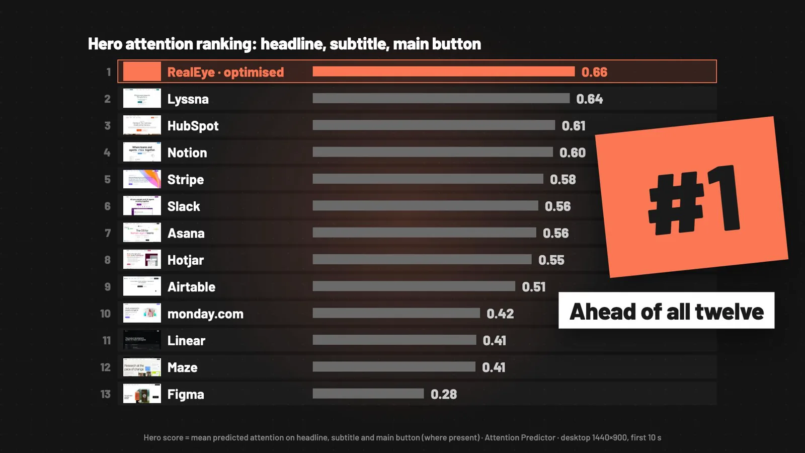
A score needs something to be compared with, so we built a ranking. We took twelve top SaaS homepages, including Notion, Stripe, Slack and HubSpot, and scored the same three areas on each: the headline, the subtitle and the main button. The average of the three is the hero score.
 Landing page optimisation with AI attention heatmaps: from 9th to 1st
What the ranking showed
- The 2021 homepage: 8th of 13. The product photo took about 40% of the predicted attention. The headline was 10th of 13.
- The redesign: 9th of 13. The big headline moved up to 4th place, but the main button dropped to 9th of 12. It sat under a long subtitle, away from where attention lands.
In other words, the redesign fixed the message and lost the button.
Sixteen layouts later
Working with Claude and Attention Predictor, we generated, captured and scored sixteen versions of the hero in a couple of hours. The winner is also the simplest: a centred hero, a two-line headline and larger buttons in the middle of the screen, with the rating and the no credit card note right under them.
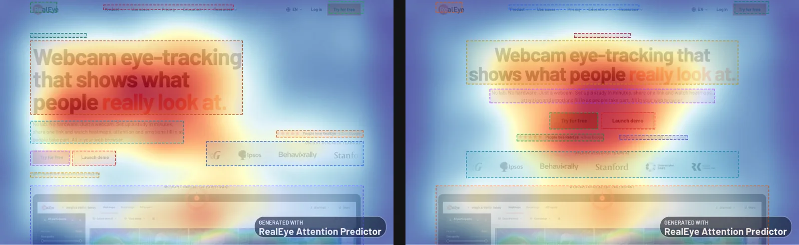
Predicted attention on the main button more than doubled, from 0.37 to 0.79. That moved the button from 9th place to 1st, and the hero as a whole from 9th to 1st of 13.
One caveat matters here: these are predictions, not measurements. They cost minutes instead of days, which makes them good for comparing many ideas quickly. The winner still deserves a study with real participants, and that is the order we recommend to everyone: predict first, then confirm with eye tracking.
What we took from it
- Looking better is not the same as working better. Our redesign won on taste and lost on the button.
- Score the parts, not the page. A headline, a subtitle and a button have different jobs. One number for the whole page would have hidden the problem.
- Position beat size. The button improved most when it moved to where attention already was, not when it simply got bigger.
Try it yourself
- The new dashboard: log in and switch on New look.
- Rank your own page: the Attention Predictor skills for Claude are public. Start with the documentation.
- New to RealEye: try it for free and run your first eye-tracking study from your browser.
 RealEyeRealEye team